Those behind the typeface describe it as ‘a positive reclamation of all those negative things society says about stammered speech’
Having a stammer is often seen as something that needs to be overcome, but why?
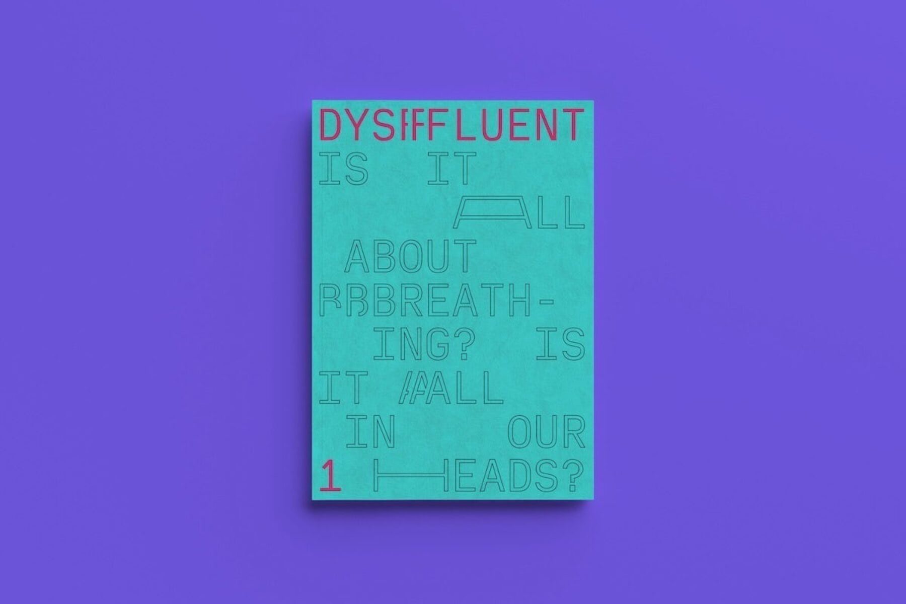
Irish graphic designer Conor Foran, who stammers, wanted to challenge this assumption. Together with Bart Rzeznik, he created a font called Dysfluent to represent the way he speaks.
“Instead of looking at stammered speech as broken or fragmented, I visualised it stretching and repeating,” he told Positive News.
That project led to the pair launching a magazine (also called Dysfluent, pictured above), in 2020 about people who are proud of their stammers.
“What about those honest, funny and frankly awkward moments that are shared between fluent and dysfluent people?” reads the magazine’s website. “It’s these vulnerable experiences that Dysfluent highlights. Experiences we shouldn’t be afraid to discuss.”
Foran describes the typeface that preceeded the magazine’s creation as a “positive reclamation of all those negative things society says about stammered speech – affirming that it is beautiful and unique in its own right.”

Images: Designs from Foran’s Dysfluent magazine: Dysfluent magazine