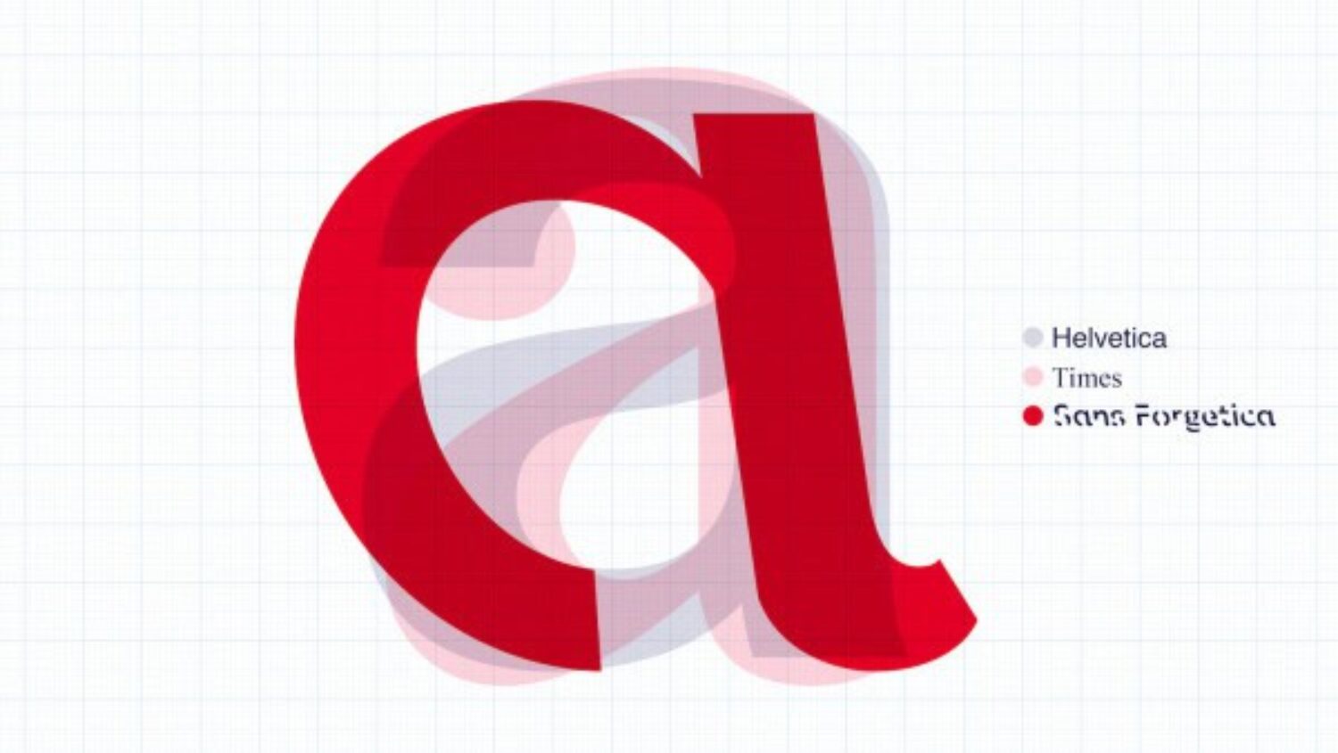
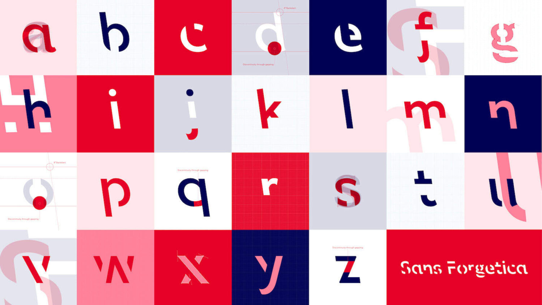
Sans Forgetica is more difficult to read than most typefaces – and that’s by design. It prompts readers to engage in deeper processing, boosting memory, say its developers
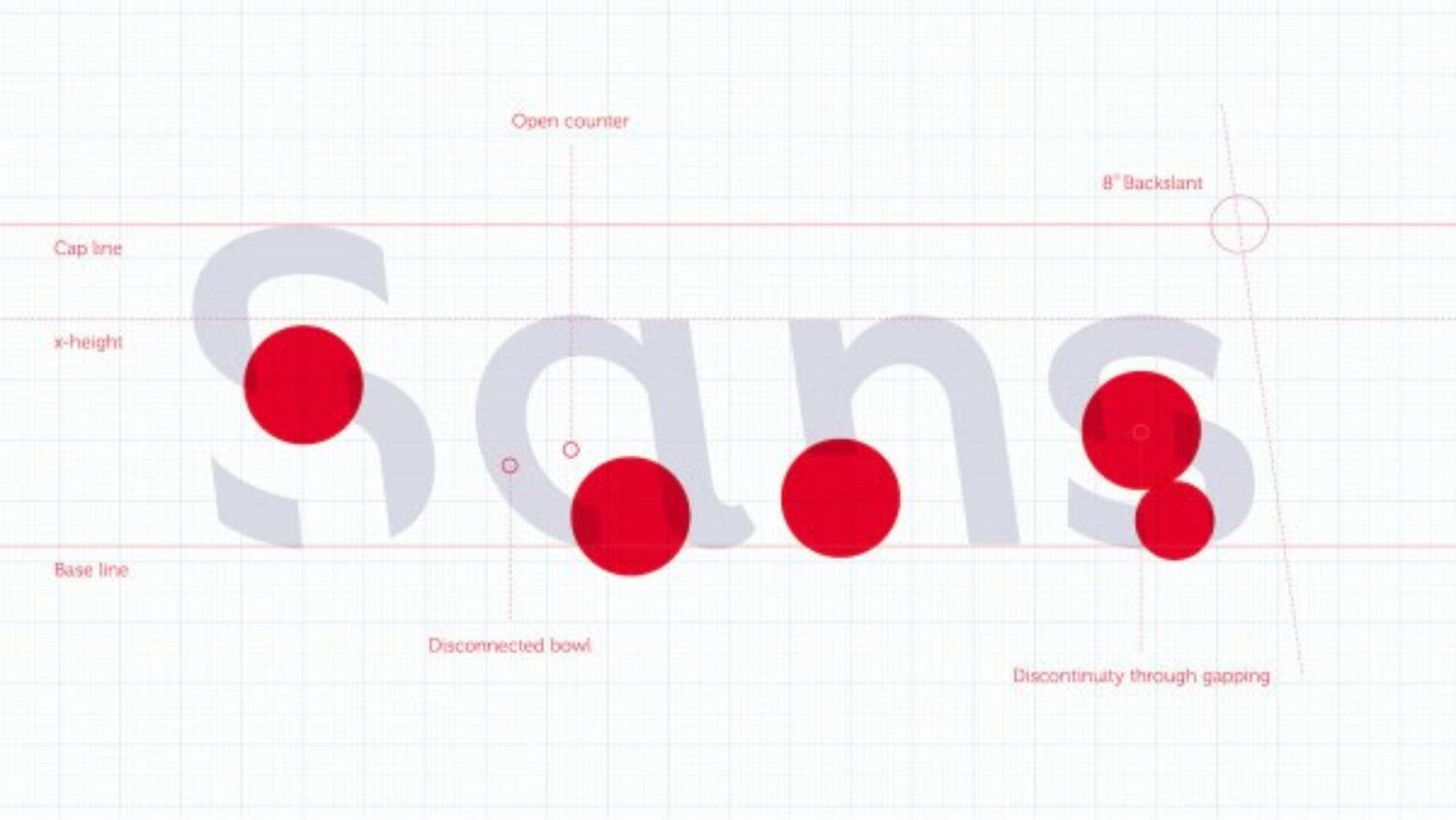
It slants backwards and has gaps in each letter, but this is no half-hearted design job. The Sans Forgetica font, created by a team at the Melbourne-based RMIT University, is said to be capable of aiding recall and memory. And it has now been made free for anybody to use.
Most fonts are very familiar, said Dr Janneke Blijlevens of the RMIT Behavioural Business Lab. “Readers often glance over them and no memory trace is created. However, if a font is too different, the brain can’t process it and the information is not retained. Sans Forgetica lies at a sweet spot, where just enough obstruction has been added to create memory retention.”
The font was developed using the ‘desirable difficulty’ learning principle. Sans Forgetica has varying degrees of ‘distinctiveness’ built in, causing readers to dwell longer on each word. This gives the brain time to engage in deeper cognitive processing, enhancing information retention. Researchers and academics from different disciplines at RMIT came together to develop, design and test the font, from typographic design specialists to psychologists.

“We believe this is the first time that specific principles of design theory have been combined with specific principles of psychology theory in order to create a font,” noted lab chair and behavioural economist Dr Jo Peryman.
Some 400 university students took part in a study that found a small increase in the proportion participants remembered – 57 per cent of text written in Sans Forgetica compared with 50 per cent in a plain Arial typeface.

The font was designed with revising students in mind, but could also be used to help people studying foreign languages and elderly people who are trying to cope with memory loss, said the team.
Sans Forgetica is available free to download as a font and Chrome browser extension at sansforgetica.rmit
Images: RMIT University


